请问有什么可以帮助您?
物产中大云商
Wuchan Zhongda Life
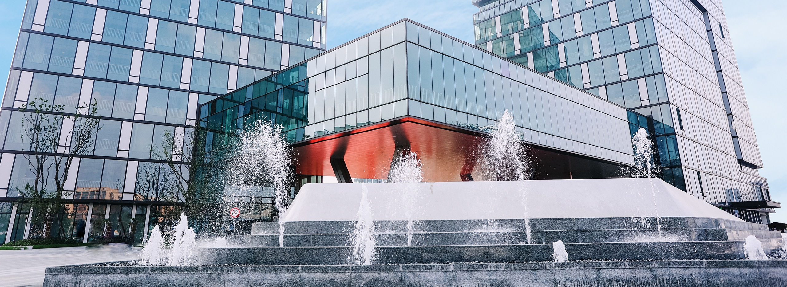
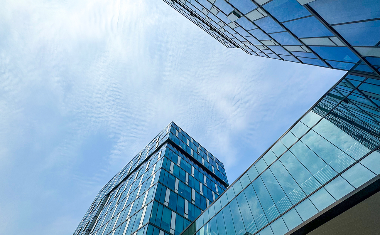
物产中大云商有限公司隶属于世界500强企业——物产中大集团股份有限公司,是其生活资料板块的核心一级子公司。其办公楼的建筑立面巧妙地融合了互联网建筑的特色元素。错落有致的“网格化”立面设计,仿佛映射出“电路板”般的立面肌理变化,生动地展现了建筑的轮廓之美。
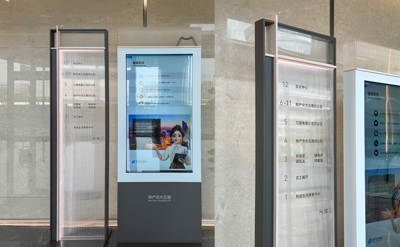
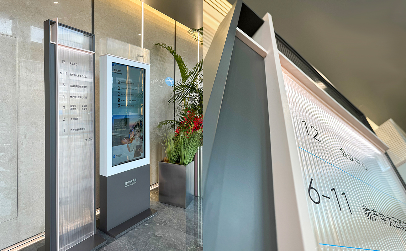
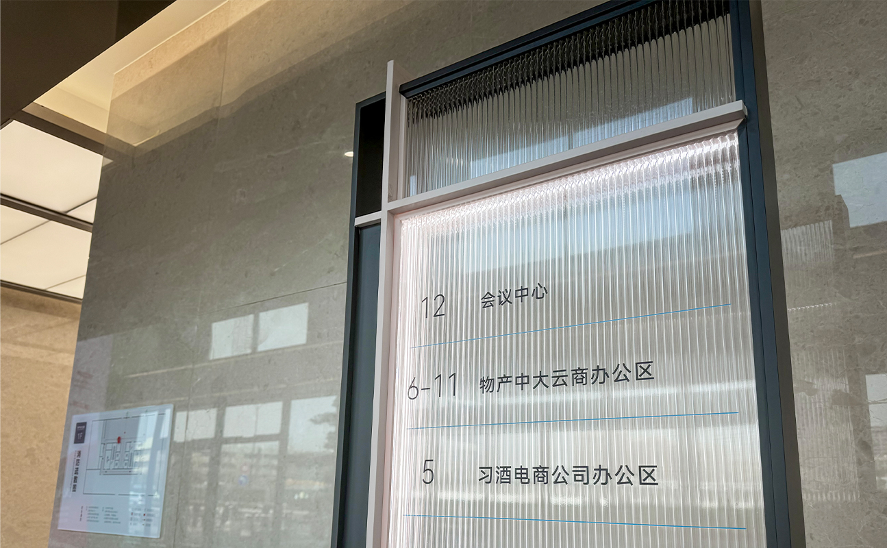
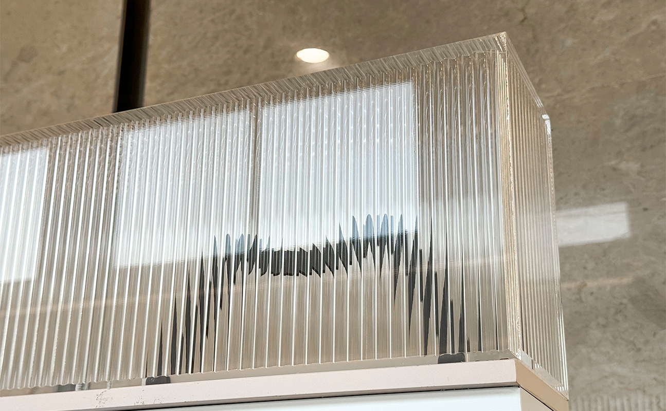
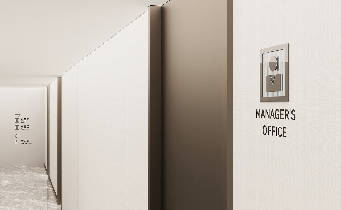
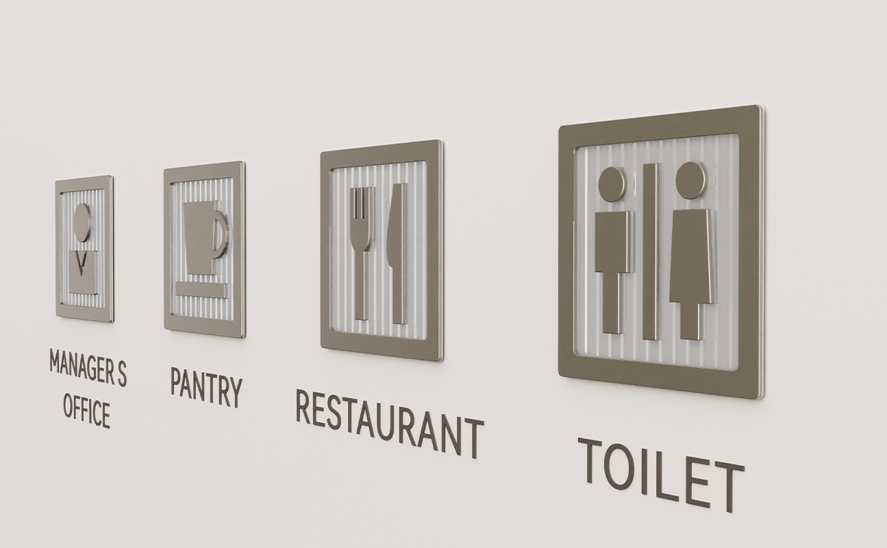
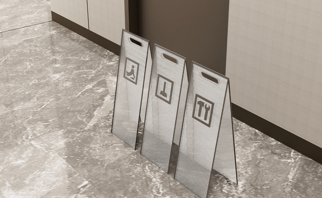
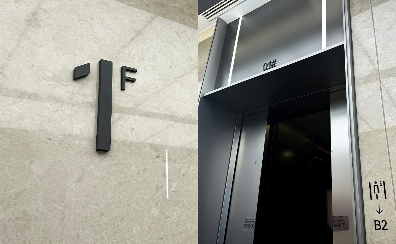
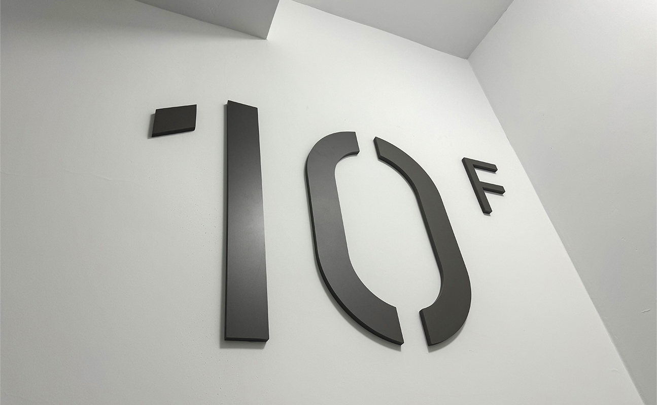
整套标识系统采用极简风,秉承“大道至简”的理念,蕴含中庸和谐的视觉美感,摒弃复杂繁琐,追求宁静而雅致,该设计反映了对简约生活的向往。此外,设计中采用了带有“浅宋韵”的纵向条纹,不仅在现代简约的风格中突出了企业的稳重感,也传达了对东方美学的致敬。为了达到图标与标识牌体的和谐共生,我们为此进行了专属icon的平面设计, 这些图标既方正又圆润,既稳重又不失细腻,传递出新时代的办公美学与视觉体验。
Wuchan Zhongda Life Co., Ltd. is a subsidiary of Wuchan Zhongda Group Co., Ltd., a Fortune Global 500 company, and serves as the core first-tier subsidiary under its consumer goods sector. The building facade of its office building subtly incorporates characteristic elements of internet-style architecture. The well-arranged "grid-like" facade design seems to mirror the texture changes similar to a "circuit board", vividly showcasing the beauty of the building's outline.
The entire signage system adopts a minimalist style, adhering to the concept of "great principles are simple", embodying the visual beauty of moderation and harmony. It abandons complexity and triviality, pursuing tranquility and elegance, which reflects the yearning for a simple life. In addition, the design incorporates vertical stripes with a "light Song Dynasty charm", which not only highlights the enterprise's sense of stability in the modern and simple style but also conveys tribute to Oriental aesthetics. To achieve the harmonious coexistence of icons and signboards, we have carried out exclusive icon graphic design for this purpose. These icons are both square and rounded, stable yet delicate, conveying the office aesthetics and visual experience of the new era.
扫码关注盛和美公众平台